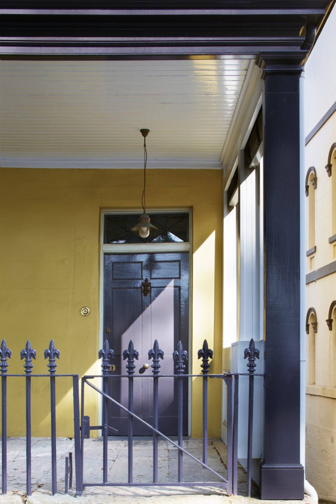
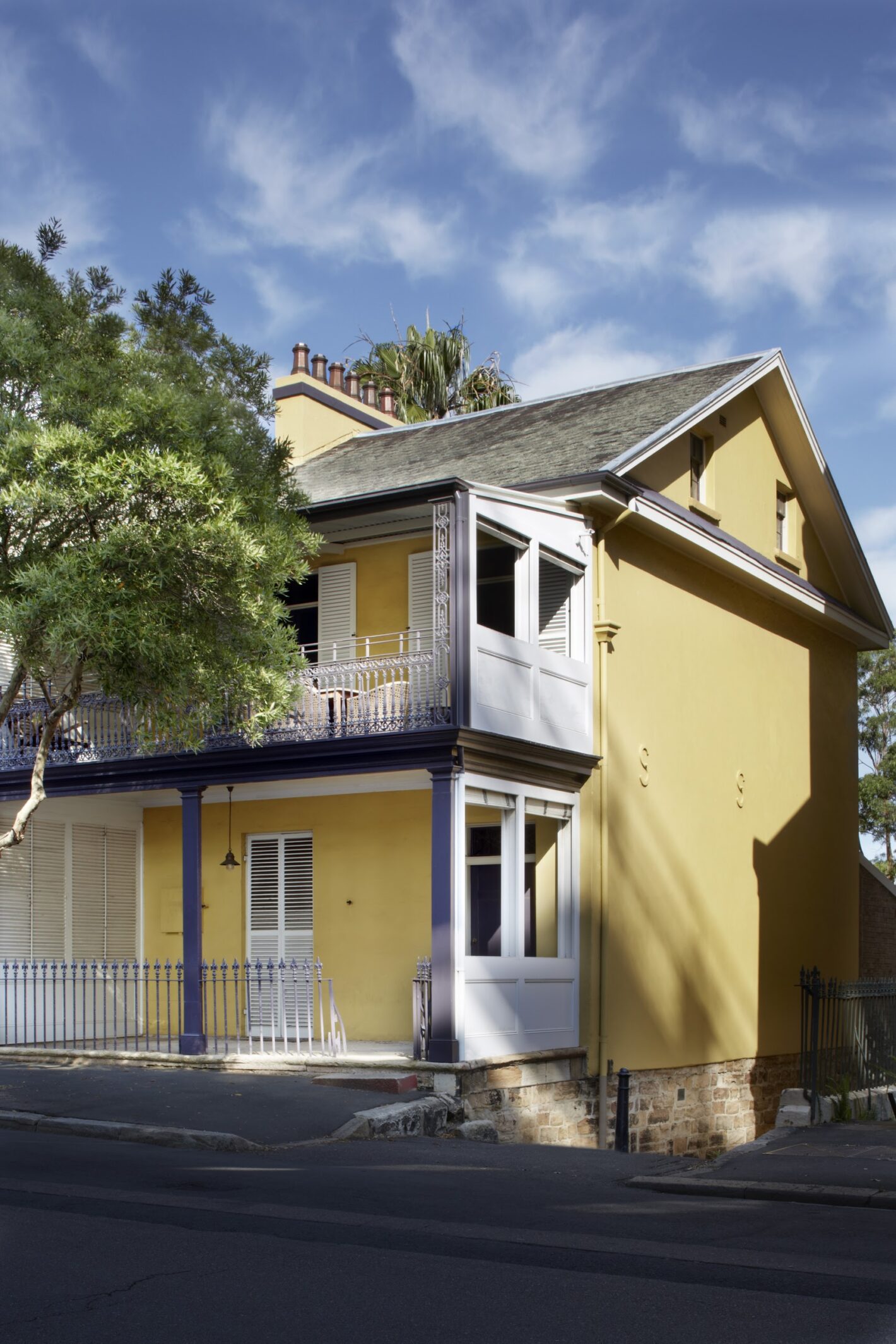
The transformation of the Harbour Masters house, built by convicts in 1832, commenced with a briefing centred on a Farrow & Ball fan deck. Our clients, who clearly had a passion for bold colour, sought to invigorate their home with a selection of modern and antique furniture and a fearless attitude to design. This embrace of colour and light drove the design of the whole project, from its mustard yellow exterior to the character of each room, which directly responded to its aspect and the furniture it needed to house.
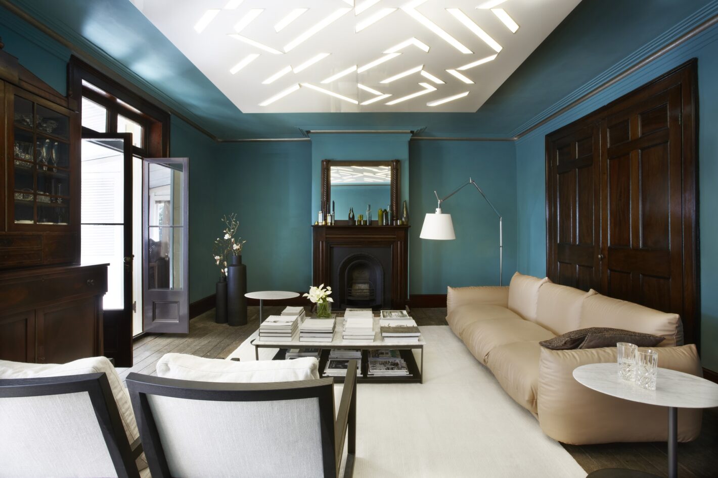
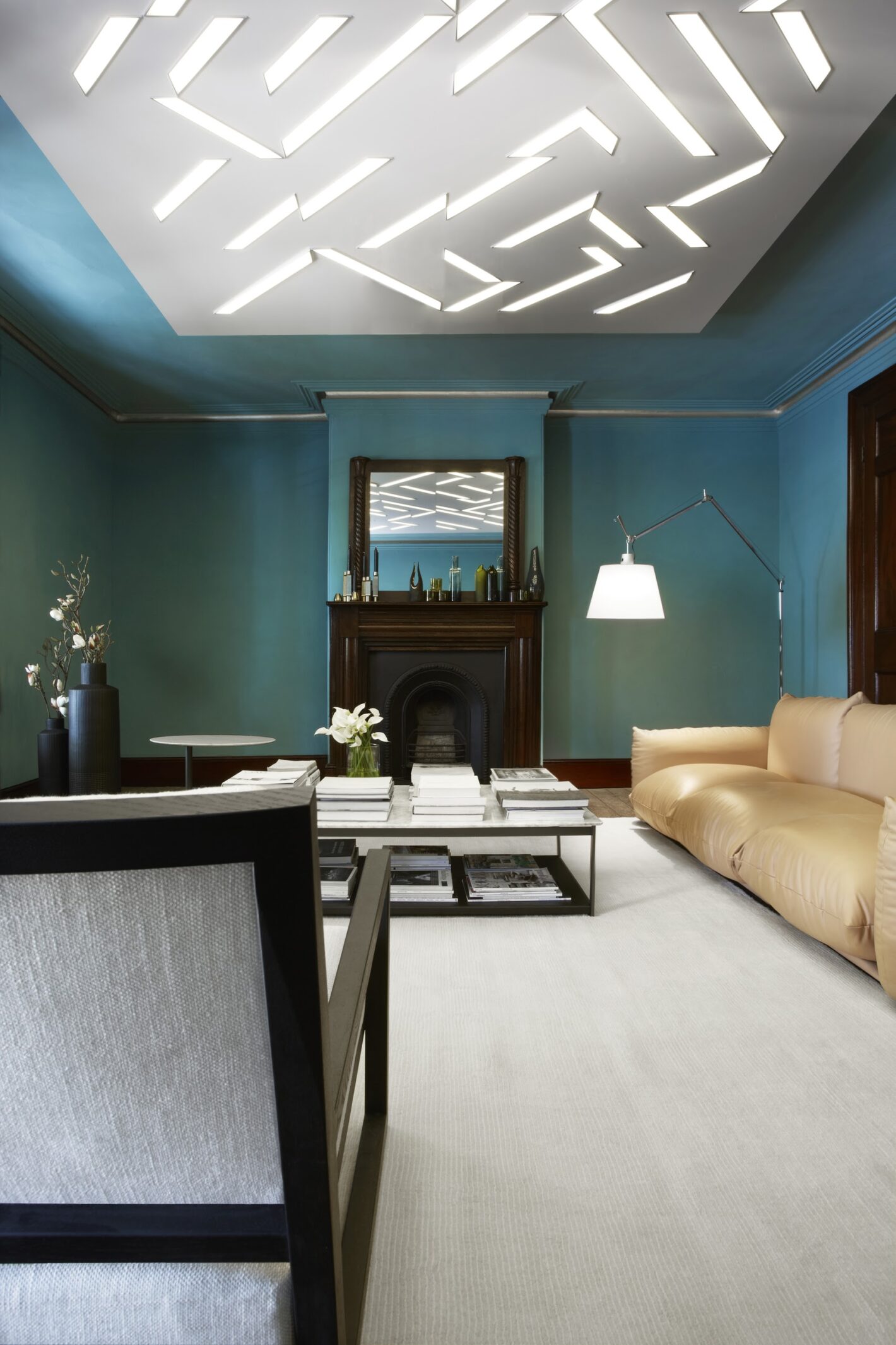
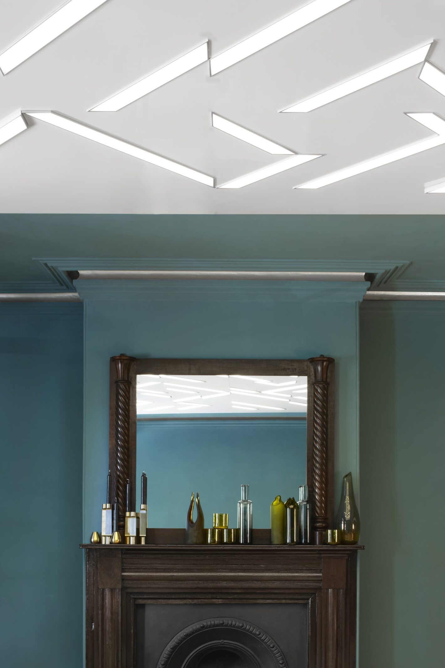
Expand ContentFor the living room, which was dark and had low ceilings, we custom-made a striking ceiling light ‘artwork’, inspired by French artist Guy de Cointet. Breathing light and life into this otherwise traditional room was a full-gloss white, floating panel with a feature light. Accentuating the drama further, the walls and ceiling were painted a rich turquoise, with pewter accents and waxed woodwork. These combined elements create a tension between old and new and give the room a distinctive personality, and an extraordinary energy.
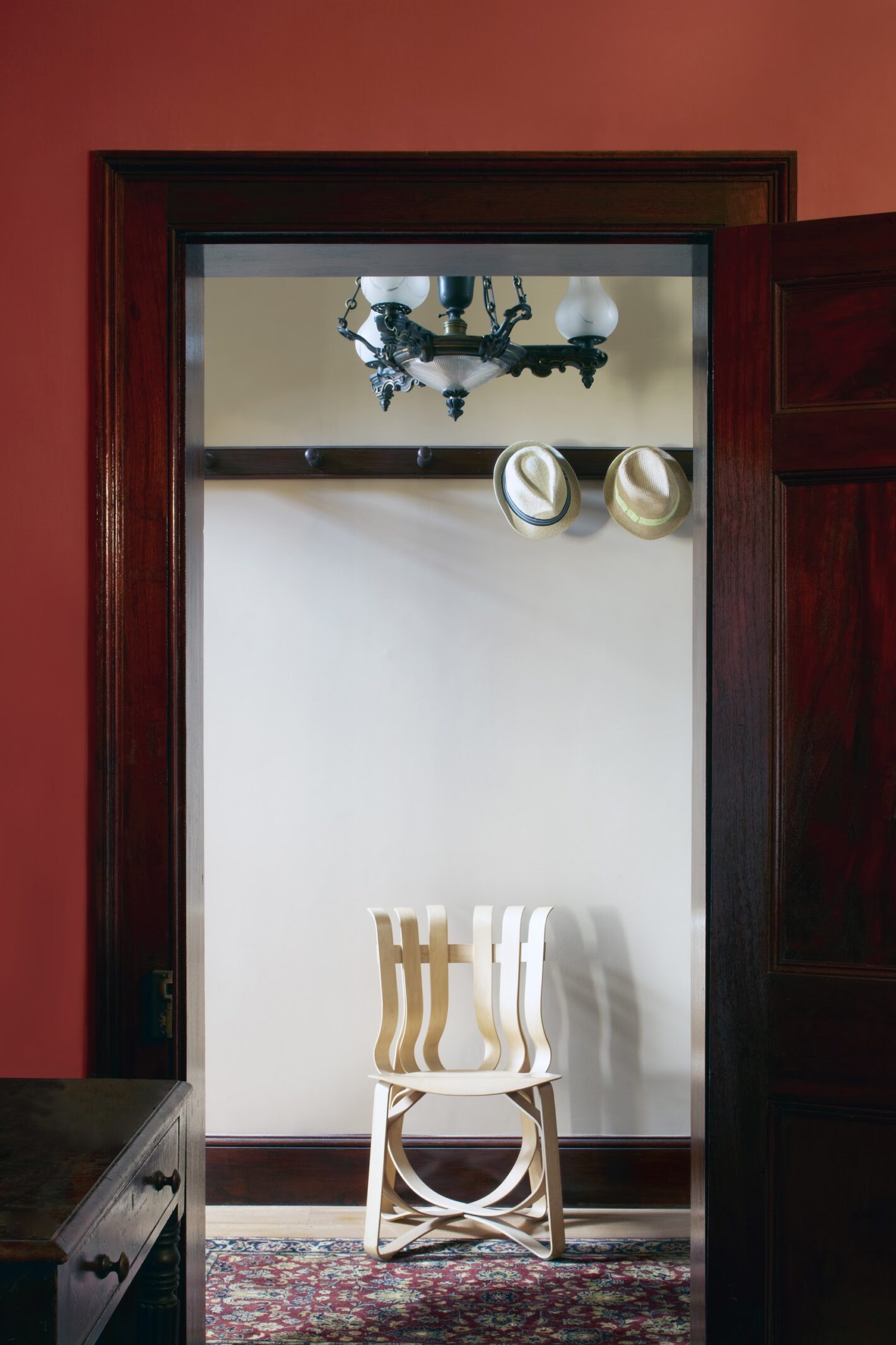
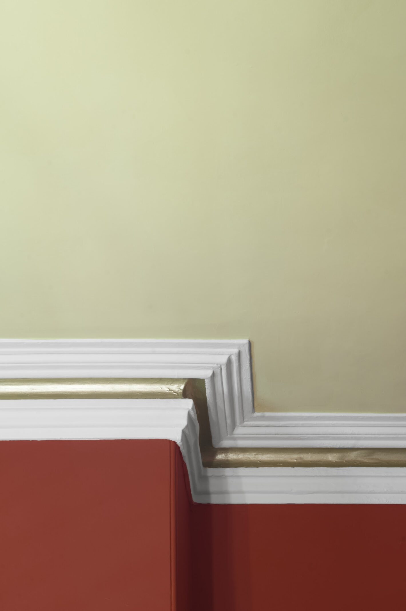
The formal dining room was painted to complement the antique furniture destined for that room. A combination of a ‘glowing coals red’ on the walls with ‘pea green’ on the ceiling and metallic gold detailing, for example, created a warm and sophisticated room that beautifully balanced its rich mahogany furniture.
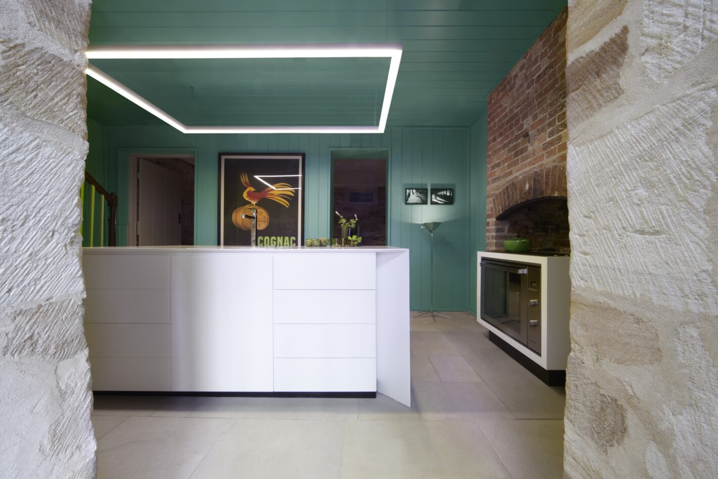
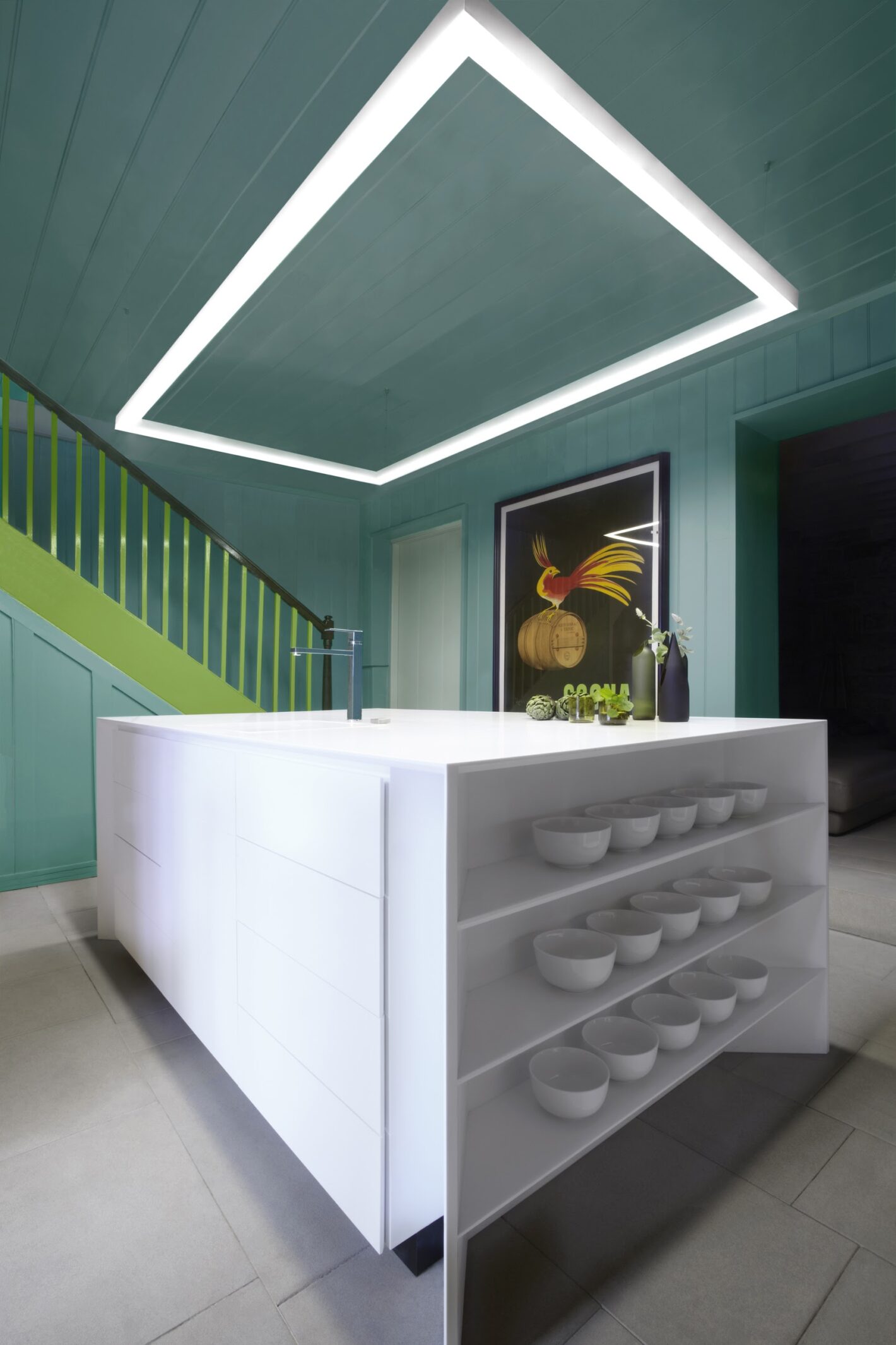
One of our design challenges was to make a happy space of a windowless room destined to become the kitchen and centre of the home. The existing staircase, repainted a lively apple green (that was discovered when scraping back the layers of paint), was then complemented to great effect with matte teal paint on the timber-clad walls and ceiling. The result is complex and dynamic, classic and contemporary, vibrant, ordered, and most decidedly happy.
As the project progressed we discovered wallpaper from the original house that had been covered over for many years. With the assistance of specialist restorers, the intact wallpaper was cleaned and restored and the breaks, cracks and gaps filled with fine render that was painted over to create a smooth surface between the salvageable wallpaper. Simple beige paint was used to complement, but not detract from, the wallpaper. Without a dramatic contrast between the two, this clearly showed the new and old parts of the room in the same way that a reassembled antique Grecian vase distinguishes its new parts from its old within its original form.

